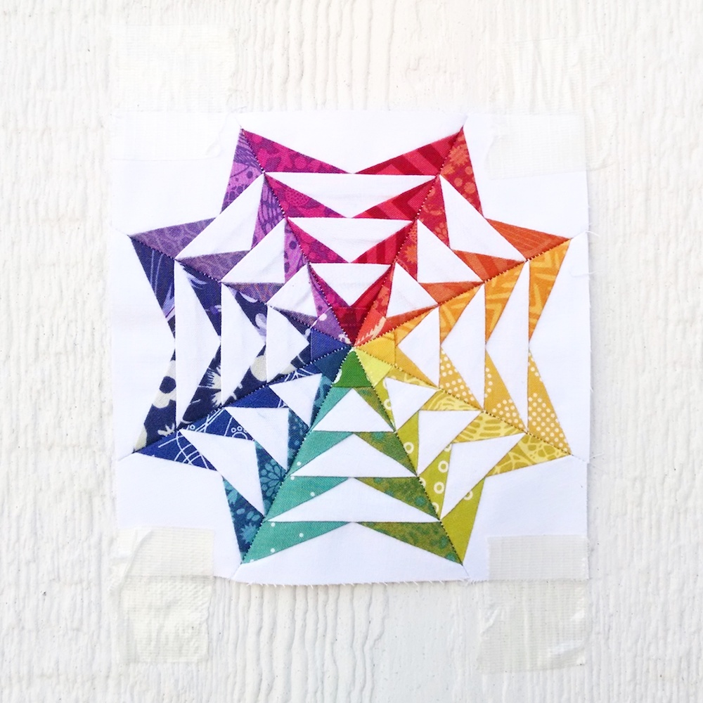
Meet 70's Geese:
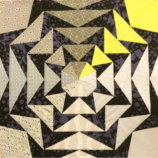
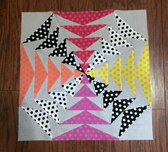
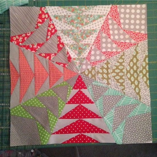
I designed 70’s Geese for a swap I was in. (It must have been a Flickr swap – because that’s when I was most involved in swaps. Those were the best!!) That was in March of 2012! Cray-cray! ;p
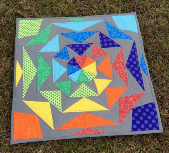
I recall that part of the reason I named it 70’s Geese was because I was using a color scheme that seemed very 70’s. lol. and it was a lot of geese, of course. lol
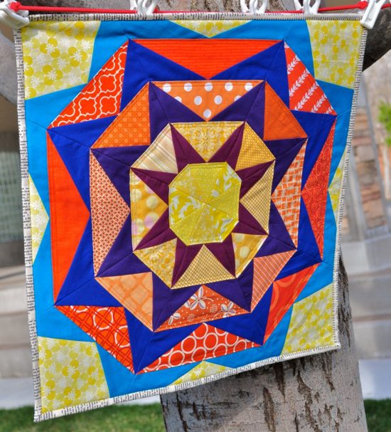
It seems kind of funny that I would name a pattern off of the color scheme that I used to make it. But hey! It works! 🙂
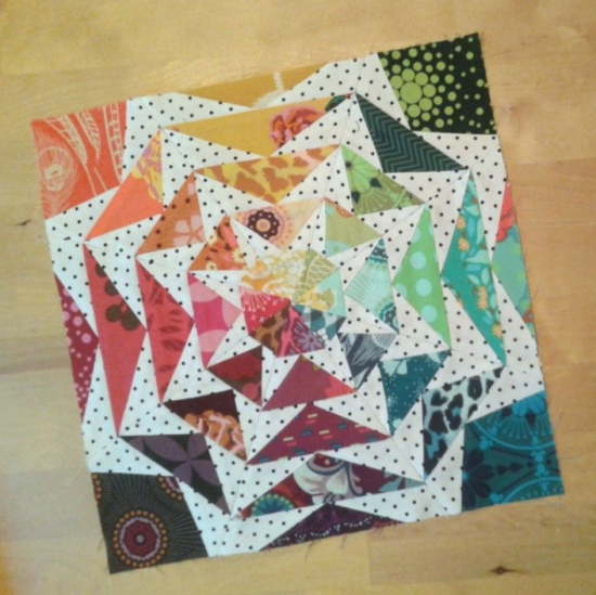
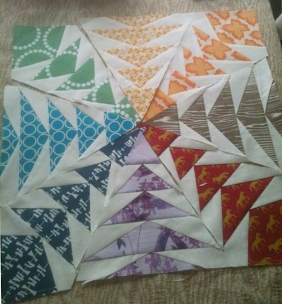
I had to go dig this photo from my Flickr account – so I’m pretty sure I’ve never shared it around these parts! It was part of the DQS 12 swap. Does anyone remember those days?? That was the best time! It’s fun to reminisce!
I think it was in October of 2016 that I updated the pattern so that the last outer rounds of points weren’t cut off. I don’t remember why I changed it, but I guess it doesn’t matter. Sometimes things just need a little tweaking I guess.
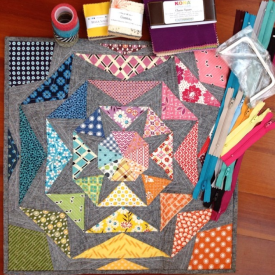
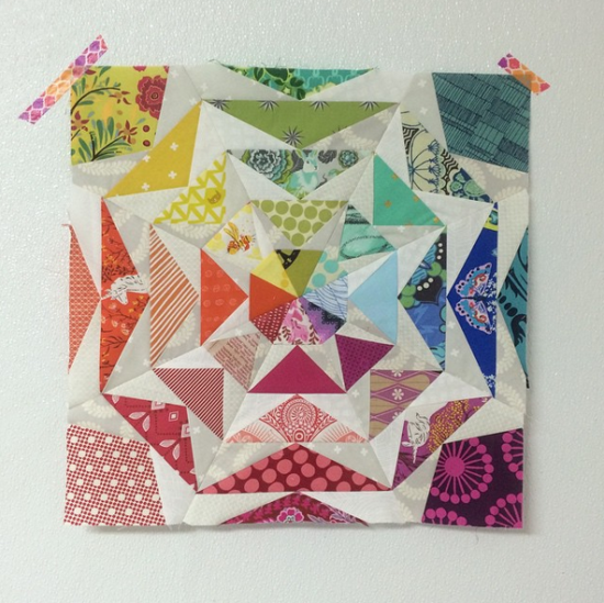
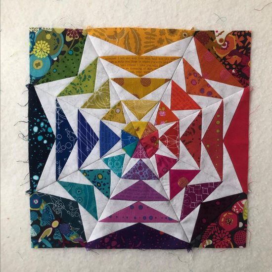
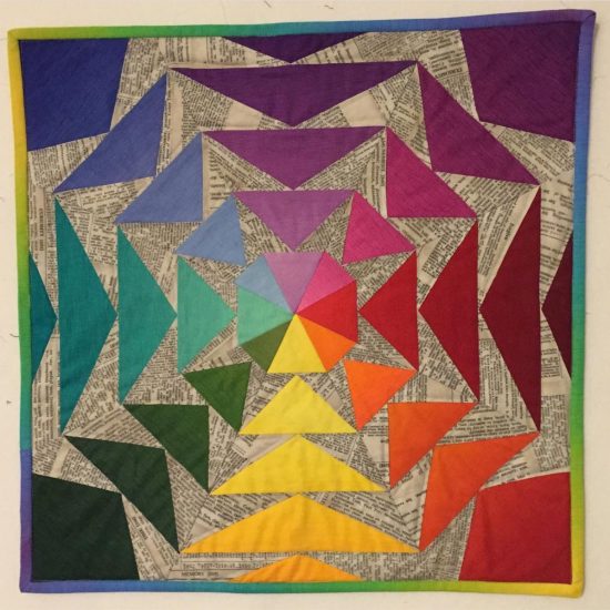
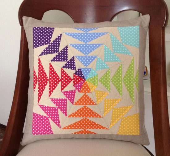
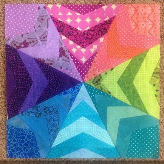
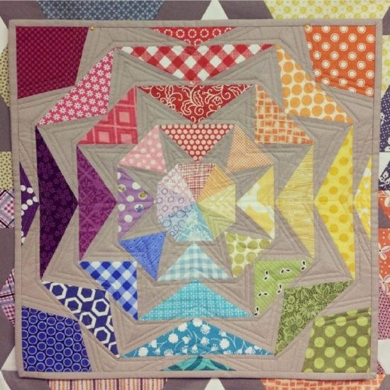
Kelly (@kelbysews) was the first person to make this pattern in the rainbow color scheme, and that’s when it really took off!
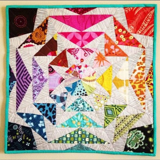
I’m always so grateful when y’all give my patterns new life and/or really make them shine!
If there’s one thing I’ve learned while designing patterns, is that it really is a collaborative effort! I could not do this without you! From testing and tweaking patterns, to watching them take flight with your own creativity. It is the most rewarding seeing what they become beyond what I ever come up with on my own. (feeling and sending all the love! lol)
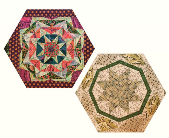
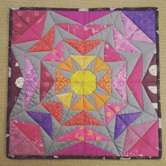
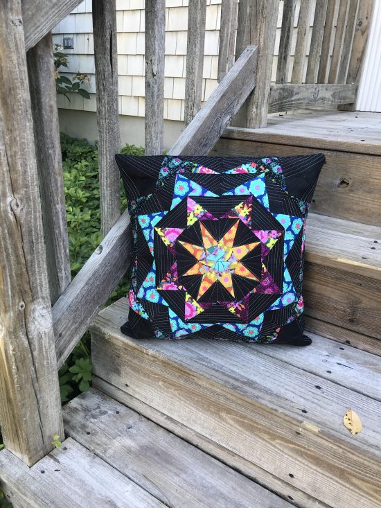
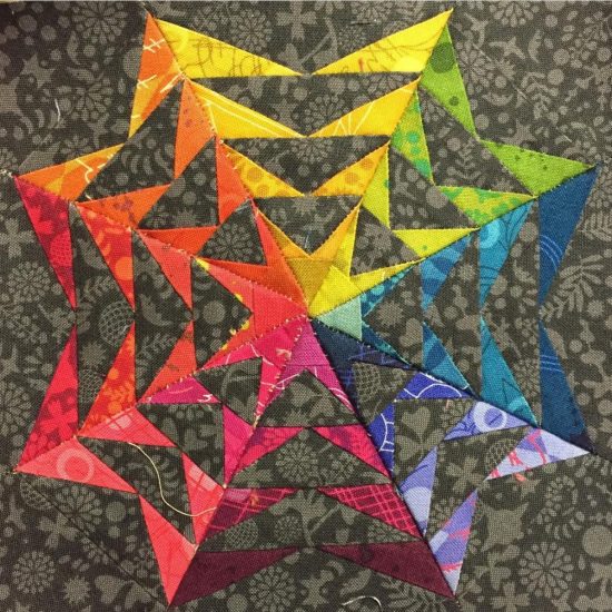
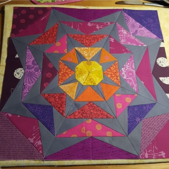
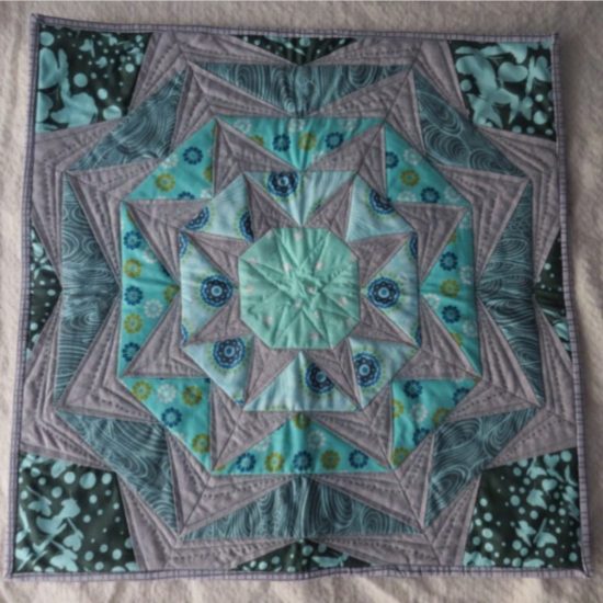
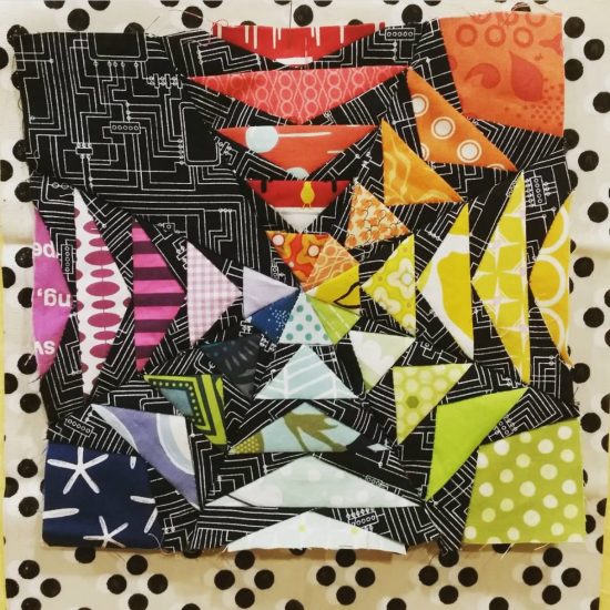
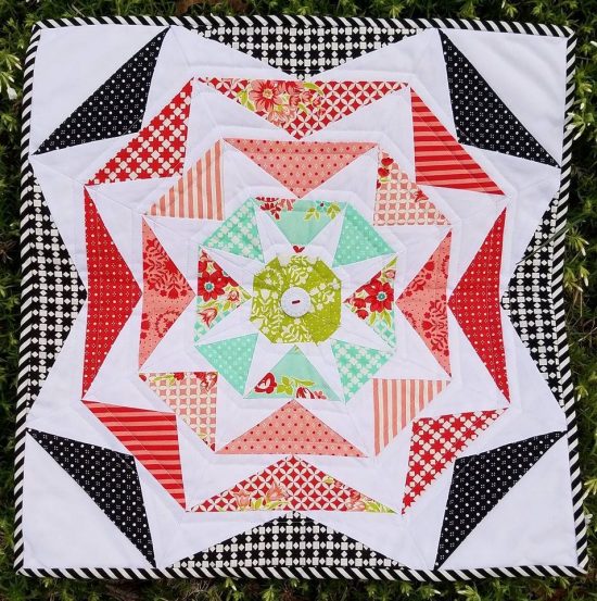
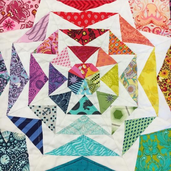
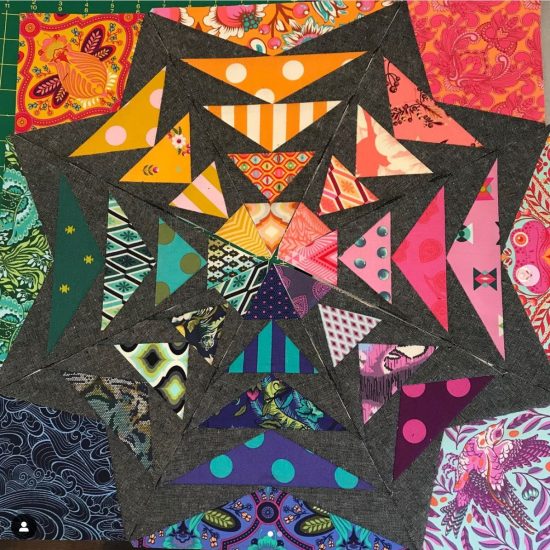
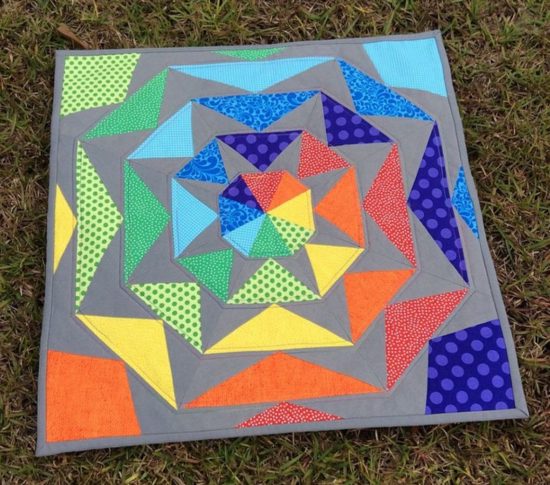
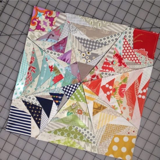
In the past 10 years (wowsers!) y’all have made some pretty amazing projects with the 70’s Geese pattern! Let’s check some of them out…
Your 70's Geese projects
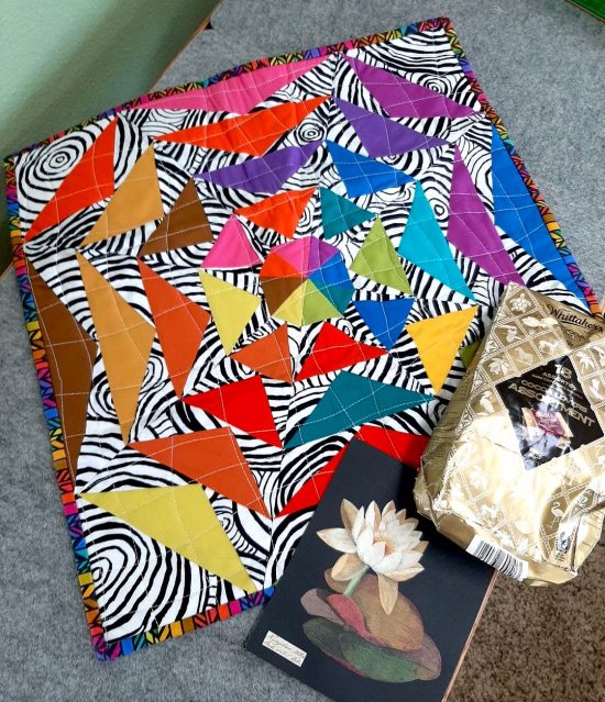
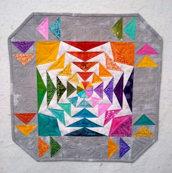
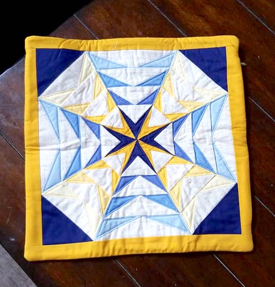
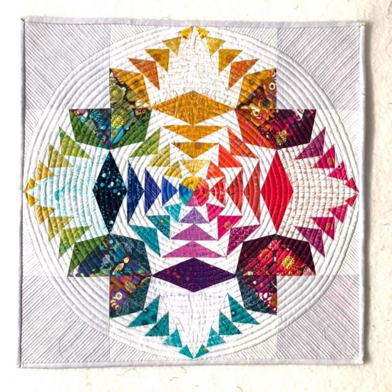
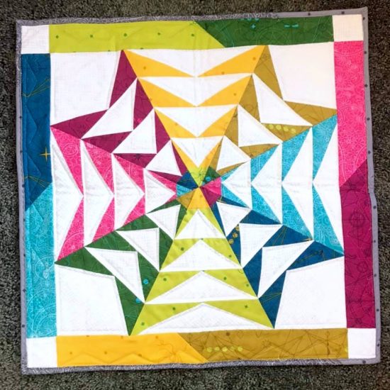
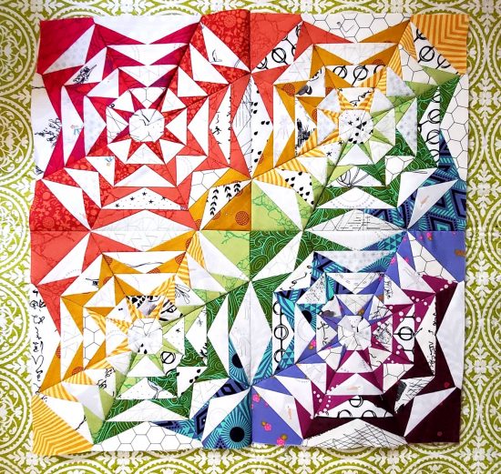
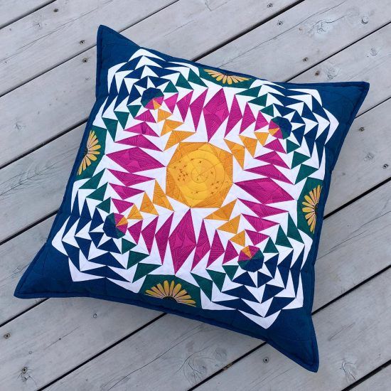
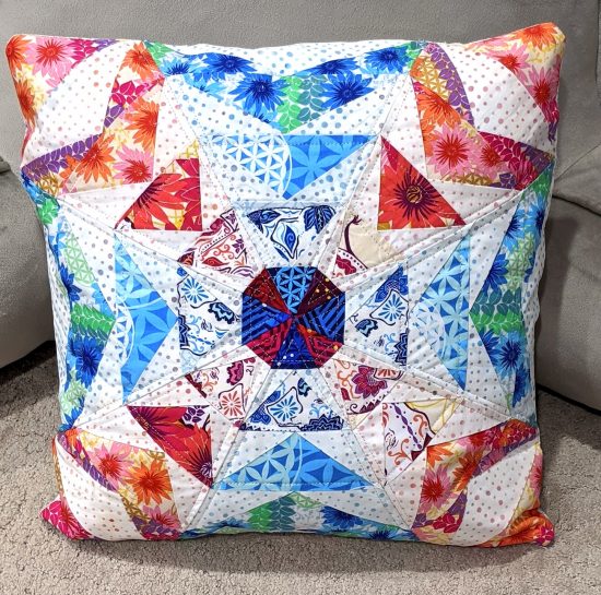


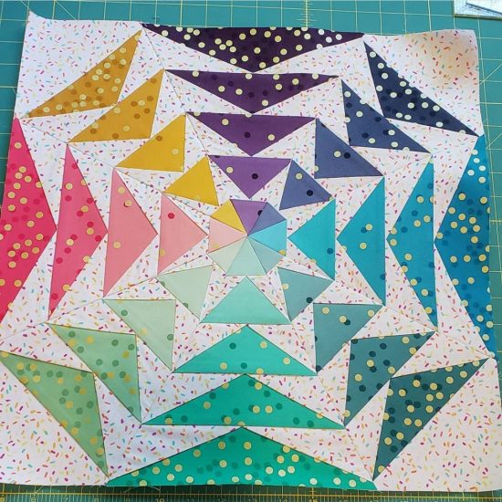
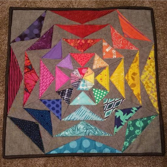
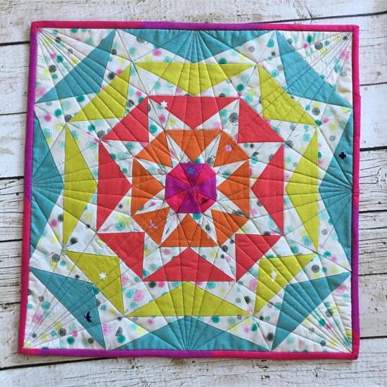
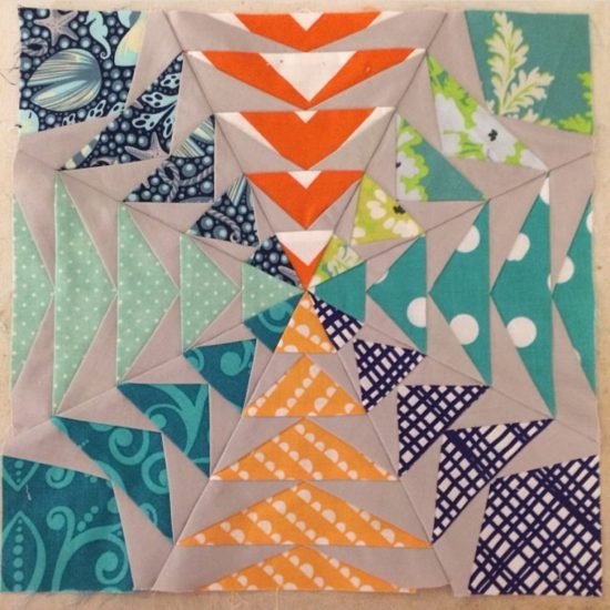
Did you know...




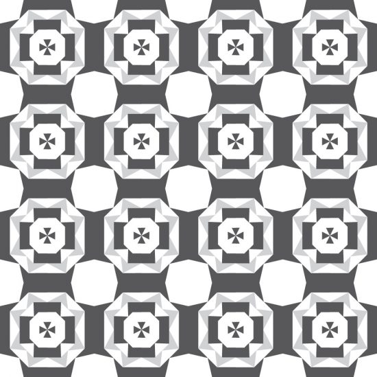

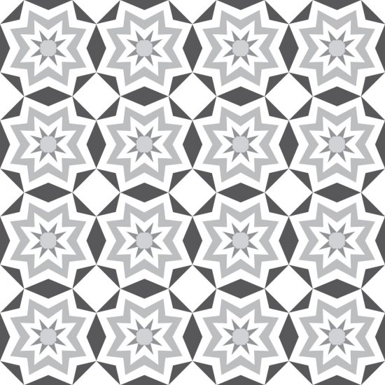



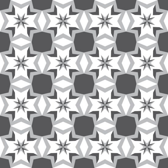

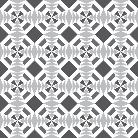



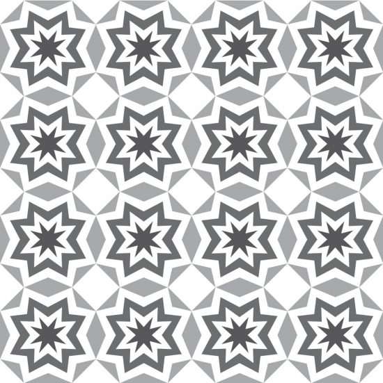

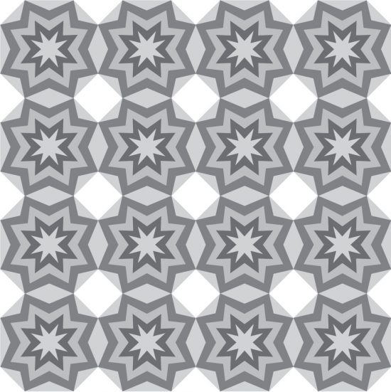

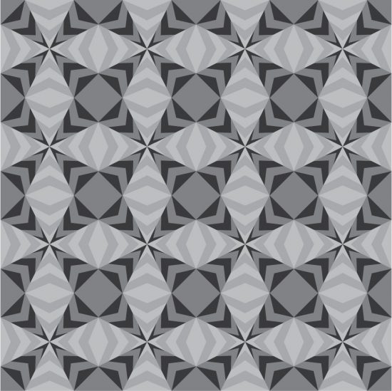

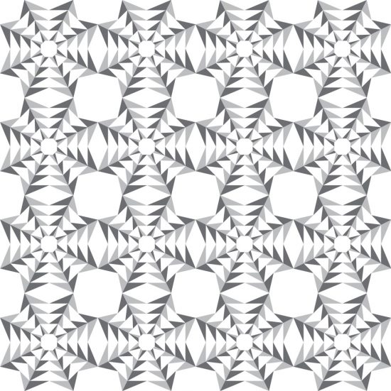

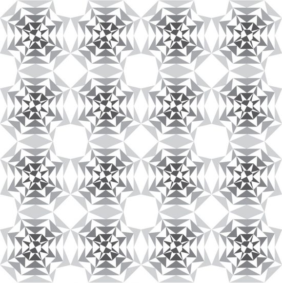

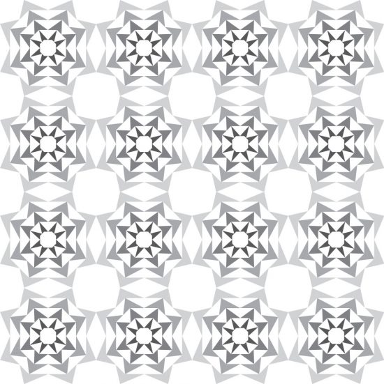

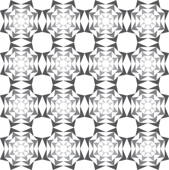

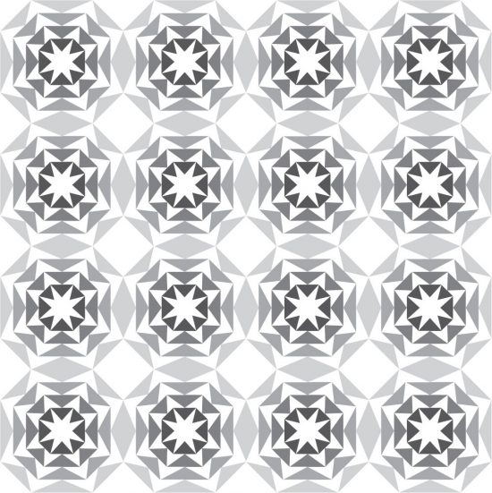

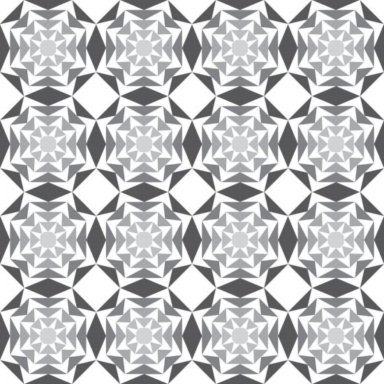

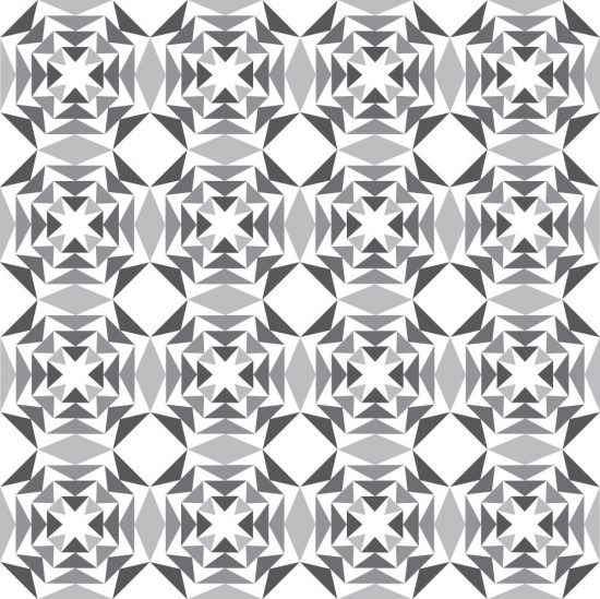
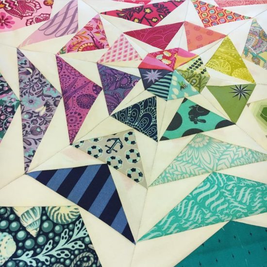
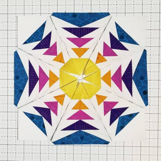
And then for that very last one… here’s adding a little color with the value scheme.
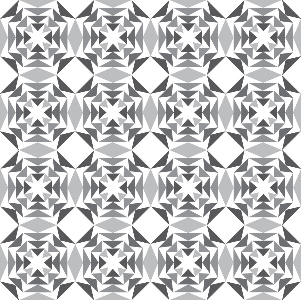
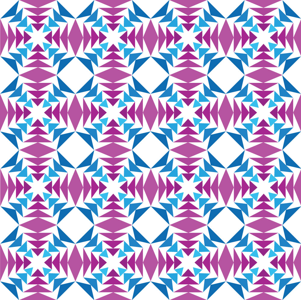
You could add even more value contrast with the color to create even more movement and 3D effect with the design.
Anyway, here’s some fun ideas to help get those creative juices flowing!
What do you think??
Are you ready to give this pattern a try??
Like my other patterns, there are lots of instructions, and everything you need to make the pattern.
It also comes in multiple sizes – for an even wider variety of projects you can use this for!
I’d love to hear what you think!
Do you like it?!
Which project is your favorite?
Are you buying the pattern?
Leave a comment below! 🙂
Thanks for joining me today!

Enjoy more posts...
Something Springy
Meet Something Springy: Soon after I designed Scrap Attack, I was contacted by Quiltmaker to see if I could design
Winter Holly
Meet Winter Holly: Winter Holly is such a fun pattern!! It’s perfect for a single block, like in a pillow,
Simple Celestial
Meet Simple Celestial: If you’re familiar with my Celestial Star pattern, you’ll recognize that Simple Celestial has the same design

